

The brand consistency problem with AI generation
Every AI image generation is essentially a fresh start. The model does not remember what it generated for you yesterday, and it has no inherent concept of your brand. This means that without deliberate controls, each generation can drift in color palette, style, mood, and composition.
For brands that need a cohesive visual identity across all their marketing materials, this randomness is a serious problem. A Facebook post that looks nothing like the Instagram post that looks nothing like the email header undermines the professional image you are trying to build.
Setting up a brand kit for AI workflows
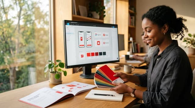
A brand kit is the foundation of consistent AI-generated imagery. At minimum, it should include your logo files, your primary and secondary color palettes, typography preferences, and examples of your visual style. More advanced brand kits also include voice and tone guidelines that influence how AI interprets your prompts.
The setup takes about 15 minutes but saves hours of inconsistency down the road. Once your brand kit is configured, every generation starts from your established visual identity rather than from a blank slate.
Color palettes and how AI handles them
AI models interpret color in complex ways. Specifying "use blue and white" in a prompt gives you very different results than anchoring the generation to specific hex values through a brand kit. The difference between your brand blue (#2563EB) and a random blue the AI picks can be the difference between on-brand and off-brand.
Brand kits that encode specific color values give you much more control than trying to describe colors in natural language. The AI uses these values as constraints, ensuring that backgrounds, accents, and overall mood align with your palette.
Logo placement in AI-generated images
Placing logos in AI-generated images requires a deliberate approach. Most AI models struggle to render logos accurately when included in the generation prompt. They will distort text, alter proportions, and generally produce unusable results.
The better approach is to generate the image without the logo, then place it using an editing tool or overlay system. This gives you pixel-perfect logo placement with correct proportions, colors, and positioning every time.
Brand voice in prompts: does it actually work?
Brand voice guidelines in prompts have a subtler effect than visual guidelines, but they do influence the output. A brand described as "minimal and sophisticated" will produce different results than one described as "bold and energetic," even with the same scene description.
The impact is most noticeable in styling choices: the complexity of backgrounds, the intensity of lighting, and the overall mood of the image. Think of brand voice in prompts as setting the emotional temperature of your generations.
Building a repeatable generation workflow
Consistency comes from repetition, not from individual effort. Build a workflow that you follow for every generation: select brand kit, choose category, set scene parameters, generate, review, edit, export. When the steps are the same every time, the output is consistent every time.
Document your workflow so that anyone on your team can follow it. Include your preferred settings for different types of content: social media posts, marketing images, email headers, and landing page images. This turns brand consistency from an individual skill into a team process.
Managing multiple brands without losing your mind
If you work with multiple brands, whether as an agency or a freelancer with several clients, brand switching is where things get complicated. Without a system, it is easy to accidentally use one client's color palette for another client's images.
Separate brand kits for each client solve this. Before generating anything, select the correct brand kit. Every setting, from colors to voice to logo, switches to that client's identity. Two clicks to switch clients, zero risk of cross-brand contamination.